Showing posts with label Digipak's. Show all posts

Friday, 31 January 2014

FINAL poster and digipak


This is the final draft for my poster.


This is the final draft for my digipak. I have included two images so you can see the bottom left picture clearly and also to see the dvd better. 


Thursday, 30 January 2014

Digipak Edited

I have made the changes to my digipak which included turning the top images around and then moving the spine. I have also shown clearly now where the extra cd (exclusive dvd) is going to be, and now you can clearly see the bottom image. I am really happy with the way that my digipak looks and I feel that it adheres to the genres of our band!

Wednesday, 22 January 2014

Poster and Digipak


This is my digipak and poster that I am going to show to the class and get the feedback on it, in case i need to make any changes to it. I am very happy with it so far as I feel that the genre is portrayed within both and that there is consistency throughout my digipak and poster, and also the music video. 

Friday, 10 January 2014

Digipak Editing


For my digipak I have included a spine and used the same typography to keep it consistent. I also used the image of the guitar above the text to convey the genre of indie/rock/folk as this is also in the main title. I changed the 'exclusive dvd inside' to black so that you can see it a lot better and makes it stand out conveying why the audience should by this unique digipak.

Wednesday, 18 December 2013

Digipak Editing


I have changed the colour of the background to a colour that is similar to the background images and the leaves to keep a consistency throughout. I looked at having an image there for example leaves but they didn't look right against the other images of leaves so i decided to change it and leave it simple and have just a colour.

Digipak Changes


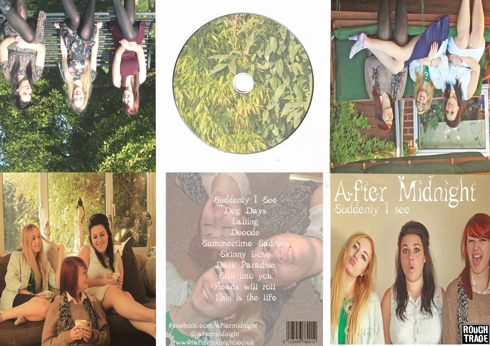
I wanted to include an element that made us appear more indie, for example the guitar. I tried photoshopping in a picture of a guitar however I feel that it looks quite out of place so I am going to leave it at is original. 

However, I like the idea of having a small image of a guitar next to the title 'after midnight' as I think this subtly gives off the same indie vibes. I will get some feedback on whether this element works within my digipak. 


Tuesday, 17 December 2013

Sixth Draft Digipak


I am really happy with this digipak as I think that it all matches quite well with eachother and I like the images that I have used. I have changed the back cover to one of us walking away from the camera and then places the tracklistings over this so you can see it a lot better. I have also used the old image of the scenery for the cd cover which i also think works really well. For the DVD I have placed trees over the cd and blurred it out to also convey the indie genre further. For the top left image I used an old one of us standing up as I think there were too many close ups and you are able to see our outfits and also the background, however I will speak to other people and ask for their opinions on whether this is a good idea or not. I need to start thinking about what to put for the spine of the CD as I have not yet included this and this is something I need to do. Also, I might place a sticker on the front of the digipak to make it different from other cd's and make it seem exclusive and worth the money. Also, I think I will include a chance to win tickets or to meet the band for fans to act as an interactive part for people and make them get excited about buying the digipak.

Fifth Digipak


On this digipak I tried including an old image back to see whether it suited it well and after consideration I do not think that it matches well over just the two spaces so I will not be using this. I am unsure of the back image with the tracklisting on as you can't really see the text very well so I am going to have to change this too. I have included an exclusive bonus dvd that comes with the digipak to make it more exciting for the fans and also persuade them into buying this exclusive digipak.

Second Draft Advertisement

As I previously spoke to my teacher and she said I needed to change the typography I have applied these changes to my advertisement so that the typography is consistent throughout the digipak and advertisement. I am quite pleased with the way it's looking at the moment however its quite plain and simple and I'm not sure if thats appropriate. I will speak to my teacher and ask her opinion on whether its fine or whether its too simple and I will make the appropriate changes to it.

Fourth Digipak


On this digipak I decided to change the colour of the CD so that it matched the colours of some of the backgrounds that we used and delete the flowers too as they looked quite out of place. I also changed the picture of us sitting on the sofa as after speaking to a few teachers they all agreed that it didn't really suit our overall look and didn't portray us as being indie, so I also changed this. I changed it to an older photo on the bench but I'm not sure that I like it because it doesn't really suit the overall look of the digipak and the really bright green background contrasts it. 


Third Digipak


On this digipak I have included the cd and I have printed the images from my top onto the cd to keep a consistency throughout and to also make it look quite unique. I am unsure on some of the images that are in it so I am going to speak to some of my teachers and ask for their opinions on the type of images I have used.

Monday, 16 December 2013

Typography Change


After speaking with sinead about my digipak and advertisement she feels that I (and also the group) need to change the typography for my digipak and my advertisement. I have chosen this font as it is quite bold which is often used in other indie genres digipaks/ cds or advertisements. Also its quite quirky too which also reflects the band, so i feel that this typography is a lot more suitable then the other flowery typography.

Wednesday, 11 December 2013

CD Cover for Digipak

As I am still unsure about my digipak CD cover I was thinking of experimenting with this picture to see if it works well as a disk cover or integrating it as one picture. The colours in this picture, with some alterations, would also work well with my digipak as I feel like my current CD cover is not relevant. I am also going to speak to my teacher on my next monday lesson so that I can get more feedback on ideas and whether it works well as a whole.

Friday, 6 December 2013

CD designs


I am trying to come up with different ideas for my CD cover as I am unsure what to use. I have coloured in the background a similar colour to the background of the front cover. I have also cropped out an image of flowers that are on my top and pasted them into the CD round the edges. This makes is seem quite indie and the use of flowers also portrays this. The fact that I used an image from my clothing also portrays this. I am going to get feedback from my teachers and see what they think about it.

Digipak Editing


I have updated my digipak as the colours were not matching very well and there wasn't much consistency. I have changed around some of the pictures, for example the back picture with our heads together is a really strong image and I think that it needed to be seen more. I have changed the typography on the back cover as it was quite hard to see and i have kept it the same as my advertisement to keep consistency throughout. I still haven't decided on an image for my cd cover as I need to make sure that it stays consistent throughout the whole digipak. 

Tuesday, 19 November 2013

New Digipak Photos

This is a video of some of the pictures that we took. I am a lot happy with these photos as they make us look more like a band and more friendly and relaxed with one another; this was one of our first issues. We have resolved some of the issues that people have said about. We have took a lot more close ups too which was something that was needed as they are a new band and need to be recognised. We had someone take our photos too which was also a lot more helpful for us.

Second Draft for Digipak


This is my second draft for my digipak. After getting feedback from the class and also from teachers about the quality of our pictures we decided to take some more. I was really happy with the new pictures as you are able to see our faces a lot more which is needed for a new band. The pictures are also quite laid back and relaxed making us fit into our genre more. I have stayed with the same typography as people agreed that this was suitable and also with the same colour. I am going to ask for more feedback on this digipak so I can make more changes if they are needed. The pictures make us seem a lot closer as a band which is also another thing which we needed to do.

Thursday, 14 November 2013

Digipak Pitch

This was our pitch to the class about our digipaks. We all spoke individually about our independent digipaks and what we wanted to be in them and of our first drafts. After getting feedback from our class mates and the teachers we are taking more photos tomorrow so we can get more close up shots of the band.

Friday, 8 November 2013

Digipak Presentation


Digipak Presentation by hayleysollis

This is a presentation which I am going to present to the class about my ideas and first drafts for my digipak. This will be very useful as I want to get feedback from other people. One teacher has said we need to change our pictures so it would be good to get other opinions too and whether they like these pictures or not.

Digipak first draft


This is the first draft for my digipak, but as we have already spoken to our teacher we need to reshoot. We are doing a presentation on monday to the class to present our digipak ideas so it will also be good to get other opinions on what I have done so far. I am still certain with having an image spread over the interior, however I feel that my ideas may change for the outside pictures.